Elda’s Construction, Realty & Home
-
Whether they’re wanting to build something new, renovate something current, or just want a little help searching for their dream home, Elda’s will be there for their clients as a solution based one-stop shop.Elda’s was a unique challenge for us because we wanted to make sure the brand conveyed the ambition and heart of the founder! Named after the founder’s mother, and colors chosen to represent her favorite colors and holiday (Christmas!), we knew that we really had to nail the heart and soul behind it. Elda’s needed to feel warm, friendly, kind, and approachable just like Elda, while also feeling like it a part of the realty & construction world AND standing out at the same time.
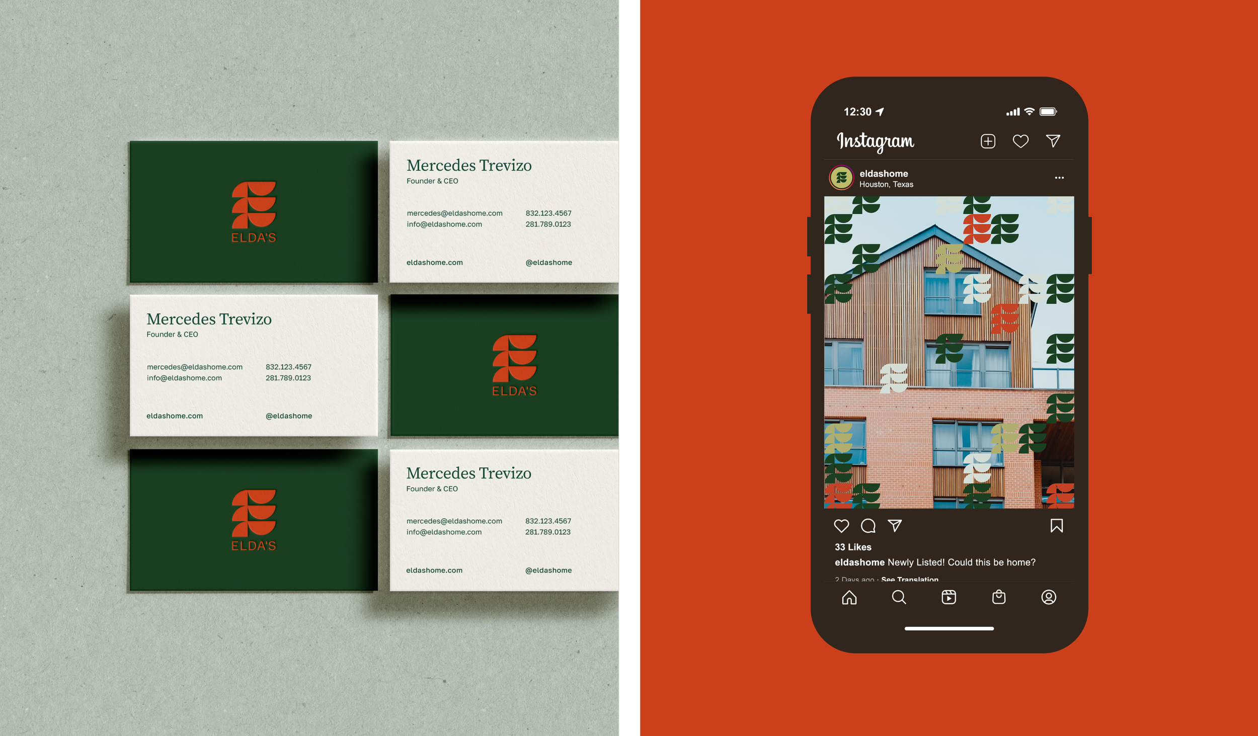
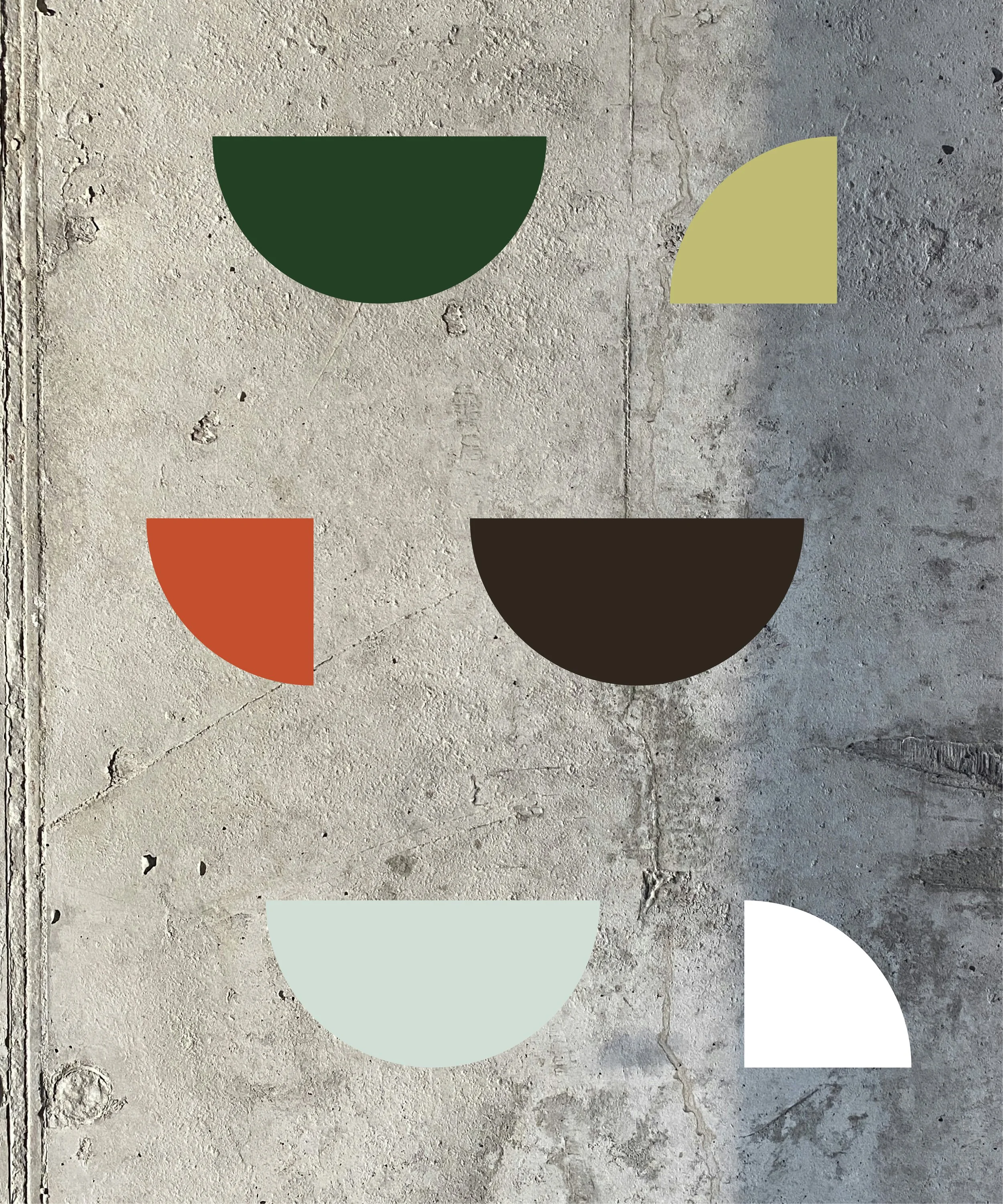
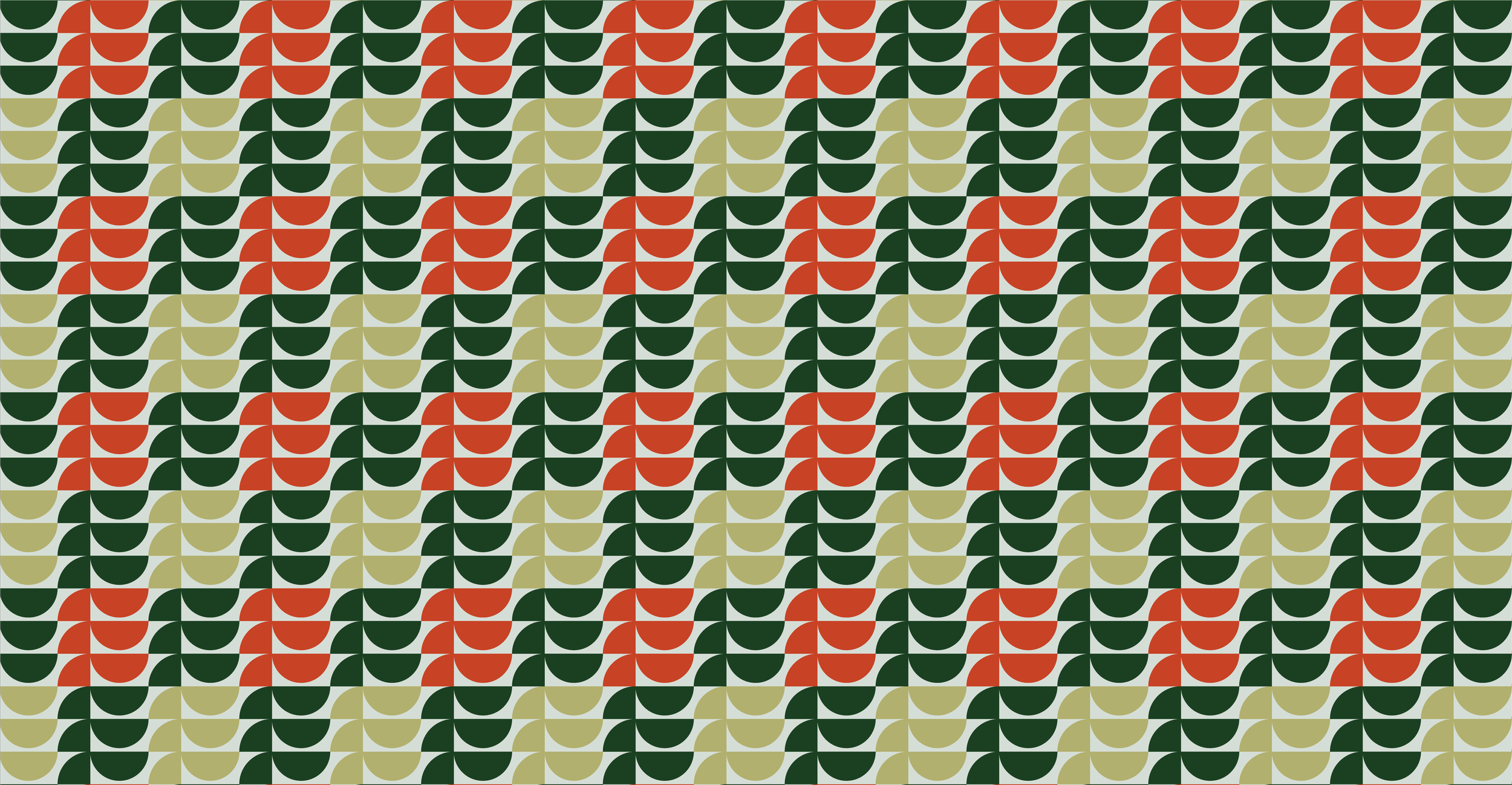
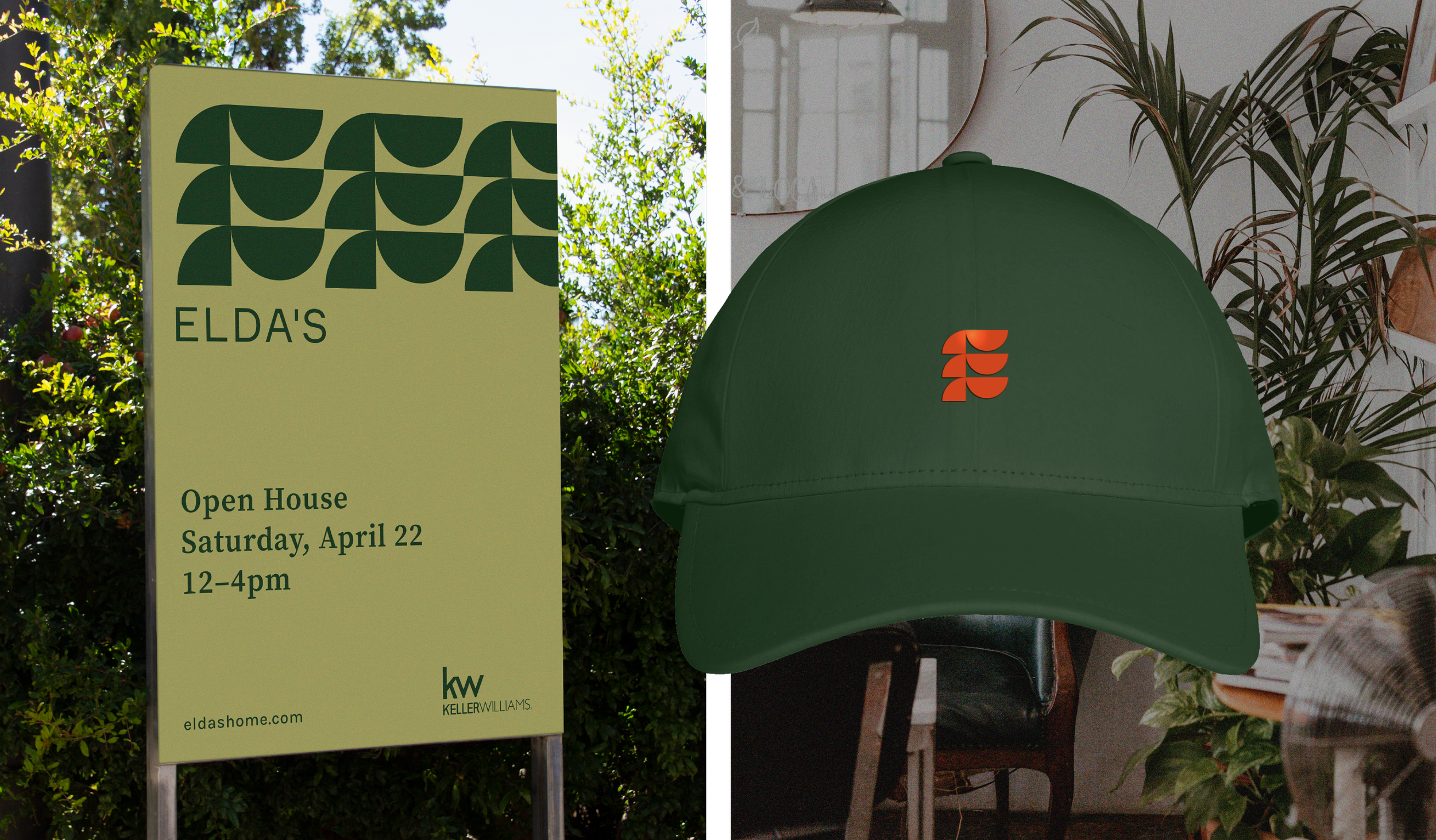
The E Icon is constructed using shapes to represent material that are the building blocks needed to construct a home.The 3 arms of the E were designed to represent Elda’s 3 values that drive the founder’s daily work: Enthusiasm, flawless Execution, and giving their best Effort to help their clients.The primary colors of this brand are green and an orangey-red, but the addition of a lighter green and pale blue, balance the brand to give it a bit of a vintage feel. Layering the pattern atop photos of homes feels as if the home is being revealed by Elda’s and presented to its audience.
-
Branding
Strategy
Social Content
Signage
Website